Dawn of a New Day
If you’re not new to this website, you may notice that it’s looking quite a bit different than it did a few weeks ago.

So long, old friend.
This website’s been around for a little while, since way back in the summer of 2011. I’d initially started this website for a few reasons:
-
I wanted to have a place where I could link people to my personal projects, making them accessible to the general public as well.
-
I wanted a place to hold some of my inane ramblings, on the off chance that they were interesting or useful to anyone.
-
I wanted to get the opportunity to play with some web technologies, as that was something I hadn’t really done before.
-
All the cool kids were doing it.
I bit the bullet, signed up for a cheap hosting plan, and set myself up a basic Wordpress-powered website and blog. I took a free theme, modified the CSS slightly to fit my tastes, and fired it up.
And, with a few exceptions, that was the way the website stayed up until last month. I added some new content to it, put up some new projects, but the overall design and layout stayed more-or-less the same since the summer of 2011.
But my needs and tastes didn’t stay the same:
-
I found I couldn’t spare the time and attention to update the blog on a regular basis. I wanted to take it out of its front-and-centre location on the homepage, to keep it from being the focus of the site.
-
I was growing increasingly frustrated with Wordpress, as I felt like I had to fight against its browser-based editor to get things formatted the way I wanted them to.
-
Wordpress was overkill for my needs. It had post tags that I didn’t use, had categories that I didn’t know what to do with, supported multiple logins, accounts, and authors, none of which would ever be needed, and it needed a substantial set of plugins for day-to-day usage. It’s a complex, fancy, dynamic website builder that I was using for a small set of content and some nearly-static pages.
-
Wordpress was difficult to customize. In order to make it look the way I wanted it to, I would have had to learn how to deal with the Wordpress “ecosystem”, which includes far more PHP than I would like to have to deal with on a regular basis. This is a big part of why the website still had that ugly, hacky look from back in 2011.
-
I had learned proper web development in the meantime, and I wanted a technology that put as little as possible between myself and the raw HTML and CSS. This would allow for more flexibility and finally allow me to play with web technology properly.
-
Because of my recent work with Caecus Games, I wanted to make sure my website was accessible to those using screen readers, again requiring bare-to-the-metal flexibility and customizability.
-
On the complete other side of the spectrum, I had recently found a wonderful online book on typography, and was eager to apply the principles I’d learned there to my personal work. More on this a bit later.
-
Mobile devices were becoming more and more of a big deal, and I wanted to make sure that the site looked good on everything from your massive desktop cinema display to your tiny little smartphone screen.
These thoughts percolated in my mind for a while. I looked into alternatives, but nothing really jumped out until I discovered static site generators—technologies that could be used to generate a website from a small set of static files. As opposed to server-side CMSes like Wordpress, which generate a page when it’s requested of them by the website visitors, these systems take a set of HTML, CSS, and text files (usually in a format like Markdown) and generate a set of static HTML and CSS files that can be thrown directly onto any old web server. Initially, I experimented with porting this website to Ruhoh, but I found it was a bit too new and undocumented for my purposes, and was a bit too eager to munch on things like SWF files that it had no business processing, throwing out cryptic errors in the process. In the end, I settled on Jekyll—a mature, Ruby-based static site generator that’s in wide use by big players like GitHub.
Jekyll
Jekyll is not easy-to-use in the same way Wordpress is. It has a distinctly different target market—while Wordpress tries to be a blogging platform for everyone, Jekyll restricts itself strictly to people who are comfortable with web technologies. It’s managed from the command line, customized via raw HTML, CSS, and YAML, with the Liquid system for templating, and offers no browser-based interface to change any of this like Wordpress does. If you’re using Jekyll, you have to know what you’re doing. The benefit is that if you do know what you’re doing, the power and control it gives you is leagues above Wordpress, because it puts much less between you and the backbone of the website.
And as a bonus, because the server you put the files on isn’t doing anything complex, it’s much more efficient to run than a Wordpress site. With Wordpress, unless you use yet another plugin, the server is going to be generating every page that’s visited, every time someone visits it. With Jekyll, all it has to do is serve up the HTML file that was made when the site was generated.
Customizations
That said, Jekyll wasn’t quite the way I wanted it out-of-the-box:
-
I switched from the default Markdown renderer, Redcarpet, to kramdown. (Update Nov. 16, 2014: kramdown is now the default Markdown renderer as of Jekyll 2.0.) I wanted a renderer that offered support for smart quotes and that played nice with the MathJax syntax I was now using for mathematical equations in posts like this. Redcarpet required more escaping of MathJax syntax, and although it supports smart quotes through the smartypants extension, I found it was far too eager for my purposes—it didn’t just replace smart quotes, it replaced things like multiple hyphens (--) by dashes (–), even in things like HTML comments, which broke many of my templates. Kramdown just worked.
-
Kramdown didn’t support the default Pygments-based syntax highlighting for code, but it supports a different highlighter, called Coderay, that, while supporting a smaller set of languages, was good enough for me, after a bit of configuration. I ended up using Coderay with a version of the Twilight TextMate theme, adapted for CodeRay by Russ Brooks, adapted again by me to fit the colour scheme of this website a bit better.
-
Jekyll’s pagination system, where it automatically generates a set of pages for the main list of posts, leaves something to be desired. It doesn’t have any way of paginating posts in a particular category, which was a problem for me, since I implemented the blog and the games page as a set of posts in the “blog” and “games” categories, respectively. This meant that when trying to paginate the blog page, I was finding games mixed in there as well. I ended up having to write a custom plug-in that modified Jekyll’s paginator to only show posts from the “blog” category. I’ll probably have to rethink this if I ever want to add pagination to the games page, but for now, it’s Good Enough™.
If you’d like to take a peek behind the scenes at how this site works and is configured, you can find the site source, the aforementioned plugin, the scripts I use to deploy this site with Git, and all the HTML pages, templates, and articles in their raw, unprocessed form at GitHub. (Update Jun. 28, 2020: I’ve since decided to take the repository private so I can have better control over what parts of this website are published to the world. The Jekyll ecosystem is as strong as ever, though, so you shouldn’t be short on inspiration and examples on how to build a site like this.)
Typography
Ever since coming across the wonderful online ebook Practical Typography by Matthew Butterick, I’ve been recommending it to nearly everyone I talk to. It’s a wonderful set of straightforward, no-nonsense tips on how to properly format written texts so that they’re pleasant to read—be it a website, a résumé, an essay, or anything else. I tried to keep to the book’s guidelines when redesigning this website, hence the minimalist, uncluttered look you see today. But it’s not so much the tips and guidelines themselves that stuck with me—instead, as I read more of it, and as I looked more into typography in general, I found myself becoming more aware of it, having a new sensitivity for the look of words on a printed page or screen.
To give an example, while I was in the earlier stages of work on the site, I was reading an article on the blogging website Medium, when suddenly the content of the article I was reading seemed to melt away, and only one thought remained in my mind:
Damn, that’s a really nice font they’re using. I want it.
That font turned out to be FF Tisa, and after a bit of hemming and hawing over needing to actually pay for a font, something I’d never done before, I ended up grabbing myself access to the font via Adobe’s Typekit service. This made it much more affordable and came with access to a considerable library of fonts along with it.
Only later did I notice that FF Tisa was actually one of Butterick’s recommended fonts, at which point I felt completely validated.
Once I had access to Typekit, of course, I experimented with a variety of different fonts and styles, and drove myself slightly insane in the process.
This font doesn’t have enough contrast between the body and headings! Kandal would make for a lighter body font—ugh, but it looks awful and misshapen on Windows! Screw it, back to Tisa. What’s a good font to pair with it for the headings? Probably a sans-serif? But which one? Futura? No, it’s far too geometric and weird alongside the relaxed feel of FF Tisa. Pragmatica? Ugh, no, it looks way too formal and rigid, and I don’t like the square dots over the lowercase “i”s. Maybe Rooney Light would be a good alternative to Tisa? Ugh, no! It looks goofy and stupid!
In the end, I settled for FF Tisa for the body text, Adelle Sans in bold for the headings, and Source Code Pro for code snippets.
But as it turns out, there was a real reason for this madness—a dark and terrible reason why nothing I was doing looked good enough.
The bug
As it turns out, on Mac computers, such as the laptop I develop on, subpixel rendering is effectively broken for light-on-dark text.
Subpixel rendering is a technique used by your operating system’s font renderer, where the red, green, and blue channels on the edges of letters are manipulated independently to give a sharper image on LCD screens, at the expense of some usually unnoticeable discolouration. In most cases, this leads to sharper text and a better reading experience. But something goes horribly wrong with Apple’s subpixel rendering algorithms when rendering light text on a dark background.
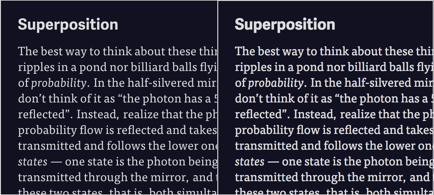
Left: Some text from the website, as seen on a Mac. Right: The same text with subpixel rendering enabled. Notice how the text on the right is much thicker, leading to much less contrast between the heading and the body text.
You can see the difference in the image above: the text that has subpixel rendering on is much thicker, to the point of looking almost bold. This caused the site to look awful—letters looked heavy and there wasn’t enough contrast between the headings and the body text to tell them apart at a glance. And until I discovered that it was a bug, it was driving me insane trying to figure out why FF Tisa looked fantastic on Medium but awful on my site.
This bug has apparently been around since Mac OS X 10.2, was thoroughly researched and documented back in 2007, was marked as “Serious” in Apple’s internal bug tracker, and then was never fixed. And with Apple moving to Retina displays for all their products, where the effects of subpixel rendering are much more subtle, I doubt it ever will be.
The workaround for this, for Webkit-based browsers like Safari and Chrome, is to disable subpixel rendering entirely with a CSS rule:
-webkit-font-smoothing: antialiased;
Firefox users are currently stuck with the chunky text, but in a few days, Firefox 25 is coming with its own solution:
-moz-osx-font-smoothing: grayscale;
Unlike the Webkit workaround, this CSS rule only affects Firefox on Mac OS X, not on other platforms.
If you’re on a mobile device, this isn’t a problem because mobile devices typically don’t use subpixel rendering. Similarly, if you’re on a high-DPI screen like a Retina display, this shouldn’t matter to you, as you have the pixel density to spare. And of course, this bug isn’t present on Windows—although I’ve found Windows’ font rendering to be worse overall than Mac OS X’s.
This solution leaves something to be desired, unfortunately. Turning subpixel rendering off is okay, but it’s less than ideal, as it can make text somewhat blurrier and more tiring to read. There’s plenty of debate as to whether or not turning it off is acceptable. But the alternative is either to deal with the fattened text on Mac OS X or switch to a dark-on-light colour scheme—and I like my dark colour scheme too much to change it.
What the future holds
So, now I’ve got this fancy new site. Now what?
Well, don’t expect a flood of new content. After all, I’m not trying to be a professional blogger. But now that I’ve got the place looking a little nicer, you might see some older games and projects of mine belatedly appear, or a bit of talk on some of the games that I quietly and unceremoniously put up over the past few months. Expect some tweaks to the design of the site as well, as I get more feedback and experiment with the site more thoroughly.
In the end, though, I like the way this turned out. Hopefully you do too.